
Where are the whales?
… and dolphins, porpoises, seals, and sea turtles?
We can only protect them if we know where they are!
A bit of background
Offshore wind is becoming increasingly important as we explore environmentally responsible energy sources. However, the installation of wind turbines produces noise which can impact marine animals – they may experience behavioral disturbance, injury, and – in extreme cases – even death. To reduce the risk to marine life, studies are conducted to understand where different animals are at different times and how many individuals are likely to be present. Precautions can then be taken to minimize the likelihood of causing harm.
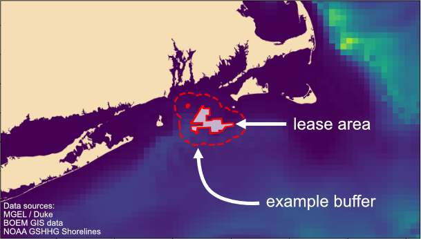
For this demo, we’re using animal density predictions from the Marine Geospatial Ecology Laboratory (MGEL) at Duke University along with GIS data from the Bureau of Ocean Energy Management. We are essentially trying to understand which species might be near offshore wind lease areas at different times of year – the same data that help regulators and wind operators plan construction schedules.
Different buffer sizes are used to represent a area of impact, where animals may hear the sound and have some sort of response or reaction. The particular buffer sizes used in this demo are arbitrary and are not based on any specific modeling – the distance over which sound can have an effect depends on a LOT of different variables which we won’t go into here.
You can think of the buffers as “cookie cutters” – you overlay the buffer on the density data, and take an average of all the values within that buffer area. Larger or smaller buffer areas will naturally result in different density averages.
Let’s explore!
In this first plot, you can explore when different species are present at different times of year. Choose a lease area and buffer size from the pull-down menus to see how things change.
The second plot allows you to take a closer look at a particular species of interest. Again – you can select the lease area, but this time there’s a second drop down to choose species. The different buffer sizes are shown as different colored lines.
The code
All of the code used to generate these images (including the map!) is available for you to browse and use however you wish (under the MIT license). Most of the prep code is on Github, in Jupyter notebooks, and the interactive visualizations were generated via ObservableHQ.com.
Sources
Roberts, J., Best, B., Mannocci, L. et al. Habitat-based cetacean density models for the U.S. Atlantic and Gulf of Mexico. Sci Rep 6, 22615 (2016). https://doi.org/10.1038/srep22615
Wessel, P., and W. H. F. Smith (1996), A global, self-consistent, hierarchical, high-resolution shoreline database, J. Geophys. Res., 101(B4), 8741–8743, doi:10.1029/96JB00104.